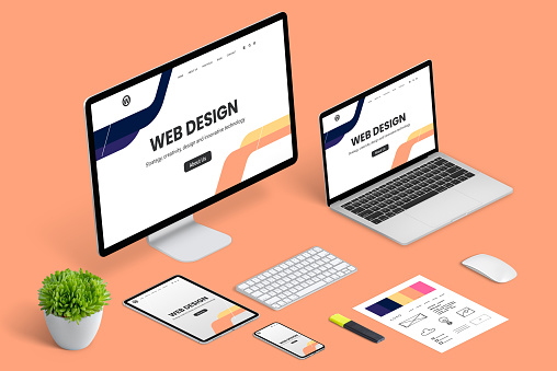
A website is the first thing that people will see when they visit your company’s website. It’s also the first impression you make on prospective clients and potential employees. So, it’s important to make sure your website is up-to-date and looks professional.
Header and Logo
The first thing that you should look for in a website design is the logo. The logo is what makes your business stand out from all of the other businesses in your industry, and it’s also an important piece of information that can help people remember who you are and what your company does.
The first step toward creating a great logo is to make sure that it has a consistent style throughout—this means that if there are different types of fonts used on different pages (or even within one page), they should all have similar styles so they feel uniform. For example: if one page uses Bold Italic letters while another uses Regular Italic letters, then those two pages would not have any consistency between them when viewed at varying sizes or widths (not only could this cause confusion among readers but also cost more money).
One way companies can avoid this problem is by using typefaces like Arial or Helvetica Neue which tend to be very versatile with regards to how many variations there are available; however these typefaces aren’t meant for small caps situations so don’t expect much success here!
Once again though…the most important part about creating good typography isn’t necessarily finding something perfect – rather than worrying about whether something will work out well enough once built…it’s more important focus attention onto making sure everything else flows smoothly together nicely too 🙂
Navigation
- Navigation is the backbone of any website. It’s what makes your site easy to navigate and navigate through, as well as where all of your important information will be found.
- A great navigation system should be clear, consistent across the site and at the top of each page. You can make this even easier by using dropdown menus with submenus on mobile devices (more on this later).
- Your navigation should also be easy to find and use on mobile devices—and not just because it’s expected now but because it’s also essential if you want people who may not know exactly where they’re going when they come onto your site from another one!
Content and readability
Content is king. It’s the reason why people visit your website, and it should be a valuable part of any design. You want to make sure that the content on your site is readable, understandable and relevant for your target audience. If you can’t read what’s written on a page or find it hard to understand, then there’s no point in having beautiful graphics or an awesome layout—you’re just wasting everyone’s time!
Images are important too: they help readers visualize things better than text alone (especially if they’re small), but they shouldn’t distract from what’s being said; if there isn’t enough room left over after including an image within its margins then it might not fit well together with everything else around it – which means we’ll need either another image or some other form of visual element like infographics etcetera…
CTA (Call to action)
The call to action is the most important part of your website design. It’s what people will interact with, and it should be clear, concise, and easy to understand.
- Your CTA should be obvious and easy to find on every page of your site. Don’t make users search for it in a sea of text!
- Make sure that relevant CTAs are front-and-center on each page—don’t hide them until you’re ready for them.
Footer
The footer is the last thing you see when you scroll to the bottom of your website. It should have links to your social media and contact information, so that people who want to reach out can do so easily. If there’s a call-to-action in your header, it’s best not to repeat it in the footer; instead, just include some additional details about how they can get in touch with you if they’re interested.
A clean design will help make sure that everything looks consistent throughout all areas of your site (header, navigation bar, content). A consistent look makes it easier for visitors to navigate around different sections without being distracted by visual differences between them—and helps create an overall polished feel for any given page on which users spend time browsing through various pages throughout their visit.”
Colors and Typography
Colors and typography are two of the most important aspects of a website.
- Use a limited color palette for your site, preferably one that’s easy on the eyes and doesn’t distract from the content on your site. A good rule of thumb is to limit each color to no more than three different shades (one primary, one secondary, and one tertiary). You don’t want anyone getting dizzy trying to read what you’re writing!
- For text-heavy pages like blogs or product descriptions that don’t need much detail about their design, you can use bold typefaces like Helvetica Neue Condensed or Baskerville Old Face; these will make sure people know who wrote them even if they were drunk during their college graduation ceremony when they had just received their diploma in journalism degree classes because they were too busy crying into their hands while watching Finding Nemo 2 again like we all did when it premiered 20 years ago at midnight because we still hadn’t learned how yet so there wasn’t anything better out there anyway except maybe Netflix but then again my parents didn’t have cable so I couldn’t watch movies online either…
These tips will help you create a great website, the right colors really make it.
When it comes to making a website, you want to make sure that your color choices convey the right message.
When it comes to choosing colors for your site, there are many things that should be considered:
- Your brand identity needs to be reflected in the colors used on the site. If you have a very specific brand identity—like if you’re an athletic shoe company or a local bicycle shop—make sure that those colors are part of your overall design scheme (i.e., not just used as accents).
- Colors can help convey emotion; this is especially true when using reds, yellows and oranges together because they create energy! As such, don’t let any lackadaisical shades get away with themselves–they may not actually fit into what’s going on around them but still give off bad vibes regardless!
Conclusion
We hope you’ve found this article helpful. We know it can be a challenge to come up with ideas for your website and we’re here to help! If you need more guidance, check out our other articles on how to create a great website (or blog).


